
Lino print
- Nov 11, 2016
- 2 min read
It's a relaxing but daunting process- at any time you can stab yourself and be scarred for life.
From the book: Cut Out - I gathered few ideas to work with to Lino print later on:

As we recognise and judge people by their faces first it's a mystery when it's unavailable so I started thinking about some ideas that illustrates this:
This idea of using a swirl in the shape of the head creates the mystery feeling as none of the facial features are now visible. I also wanted to use a question mark surrounding the head but after some developmental work, it didn't work as an arrangement but it led me to come out with a layout which looks like a speech bubble coming out of the swirl.
This idea is to implicate ''all you have are my words now'' - so judge on
As I will be using this to produce a Lino print, I produced a digital version -- so I don't get this wrong.. (i've never done it before... )

When it came to actually producing this design onto lino - I've realised I needed to change few things such as the texts font size - it will be impossible to get it perfect and this small so to make it easy I traced and guided myself where to carve the letters in but freestyle. Also since the process involved doing everything opposite, I reduced the full name to just initials.
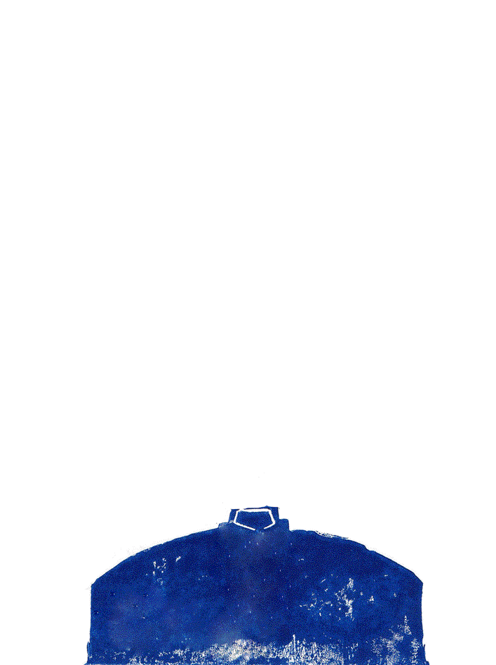
Here's the result of the first try:


The background was accidental as I wanted a plain background but as the impressions of the carved out lino were made on the print, it made the whole image much more interesting and better. As there were a lot of things I could improve on -- especially the type - I decided to give it another go.
I enjoyed the printing way too much - (even though I stabbed myself deep.)
So Take 2 !


The texts are now legible and as a whole the piece to me looks great! The impressions made by the carved out lino is much bolder and lets the focus be on the swirl head.
Kind of remind me of Dr. Seuss?
My favourite part is the background as it has this movement to it - moving towards the head. The roughness look where the ink didn't reach the paper gives the piece a beautiful texture.
I wil definitely be using lino again, it's now one of my favourite printing processes. It's so relaxing whilst you focus into it.

After many attempts to get the ink printed on the right places, I wanted to experiment with different colours as well.
Having this gradient from red to blue makes this piece change it's mood - too extreme/powerful.
So at the end I left it as with one solid colour lino print.
Good experiment though!


Comments