
Logos: it's FINALLY OVER.
- Oct 28, 2016
- 2 min read

I remember when we got the word 'Editing' for this project and thought - ''that's easy!''
BOY , WAS I WRONG....
I'm still not 100% happy with the final outcome as I think after all the development and experimentation, I was finally close to having the perfect logo that represents the word 'Editing'.
Should've's , Could've's
Looking back, I think as a group we could've done a better job at researching the depth of the word, as we ended up having to create things that were not representing the true meaning of editing. We knew what editing was but it was extremely difficult for us to come up with one single visual representation which symbolised the process and this really shows when it comes to looking back at the outcomes we came up with.
The previous outcomes were focusing on one single element of what editing consists of which almost discarded the main focus/ objective of the logo.
Processes such as Selecting and Cutting was focused on when it came to developing and I think as time went by, the main objective was lost as the outcomes only represented those words rather than 'editing'. Rather than continuing to develop logos that were only focusing one element at a time, it should've been just a starting point, which we would use to move on and experiment more referencing to the meaning of the word.
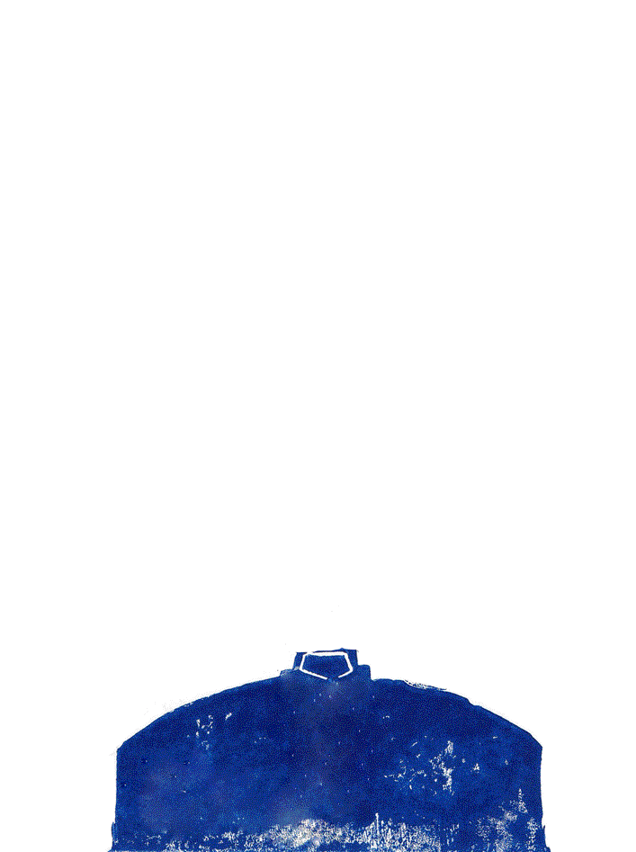
But the idea of cutting the word up and having that falling effect worked well to represent the keeping and discarding element. I feel that if i had a little more time, I would work on the falling effect as it still doesn't look right to me.
By all means, this outcome is definitely not my best, BUT there were a lot of things that I ended up learning about:
Physically working with logo or the main objective really enhances the ideas and helps to develop further
When it comes to creating a logo it is important to increase and decrease the sizes at extreme amount - to see whether it is still working as a logo, whether it could still be understood and clearly see the whole logo
FILL THINGS IN! - outlines are not bold enough, where ever there's a gap, if possible, fill it in, see how it will look! - work with negatives and positives
Don't use a pencil
Looking at other people's pieces really helped to see what are good/bad logos and why.
It's definitely easier to be critical towards other work than your own. And doing that with a group made me understand what to look for and how things are seen as.
Logos do take a while, sometimes the perfect idea comes in within 5 minutes and sometimes it takes 5 years.

The end.


Comments